Examples of Facade Design: Project Readings in Apartment, Villa, Office, and Industrial Buildings
- 2 days ago
- 16 min read
Facade design cannot be approached in the same way for every building type. While a repetitive residential floor plan needs to be transformed into a stronger rhythm on an apartment building facade, corporate visibility, signage layout, solar control, and technical infrastructure may become more decisive in an office building. In villa projects, privacy, garden relationships, and open living scenarios take center stage; while in industrial and workshop buildings, the balance between production, service, and corporate identity becomes crucial.
In this article, we examine facade design examples developed by AllRender at different scales, not only through their visual results but also through the architectural decisions behind them. Our aim is to demonstrate, through project examples, that facade design is not simply a choice of cladding or decorative surface arrangement; it is an architectural process shaped by decisions regarding proportion, mass, openings, materials, entrances, signage, landscaping, nighttime perception, and feasibility.
If you're curious about the fundamental concepts of facade design, how to approach it according to building types, and how the process works, you can first check out our article , "What is Facade Design? A Modern Facade Design Guide ."
Reading Facade Design Through the Project
Judging facade design solely based on the final visual appearance is incomplete. What often makes a facade strong is not so much the chosen cladding material, but rather the building's proportions, the arrangement of openings, the rhythm of the balconies, the decision regarding the entrance, the relationship with the ground floor, signage control, technical infrastructure, and its relationship with its surroundings.
Therefore, the following examples should be considered not merely as visual presentations, but rather as brief analyses of design decisions made in different building types. Each project has been evaluated within its own scale, budget, usage scenario, and architectural potential.
Project Example 1: Apartment Building Facade Design
In this apartment project, the facade design was conceived to transform the repetitive residential floors into a calmer, more refined, and legible architectural rhythm without creating monotony. The window proportions and opening arrangement in the existing project were re-evaluated to create a more systematic modulation. Thus, the facade ceased to be a surface composed of random openings and acquired a more controlled and balanced order.

60x120 cm travertine-look ceramic panels were proposed for the main facade surfaces, and it was envisioned that these surfaces could be applied using a mechanical facade system. White horizontal moldings created a strong band effect that gathered the floor lines using a matte aluminum cladding approach. The wide eaves proposed at the top were considered one of the main elements that horizontally integrated the structure and gave the facade composition a strong finishing touch.

The aluminum profile cladding used above the windows was designed as distinct surfaces that define the openings and reinforce the facade's rhythm. Window frame decisions, sliding openings, and facade modules were evaluated in collaboration with the client to create a more organized system.

The proposed vertical glass band on the side facade was one of the project's significant interventions. This opening, which coincides with the dining area in the interior, was proposed not only to create a vertical accent on the facade but also to allow more natural light into the interior and to more strongly connect the dining area with the facade. Similarly, the corner glass solutions proposed in the corner apartments enhanced the use of the living room while giving the facade a more spacious and contemporary character.
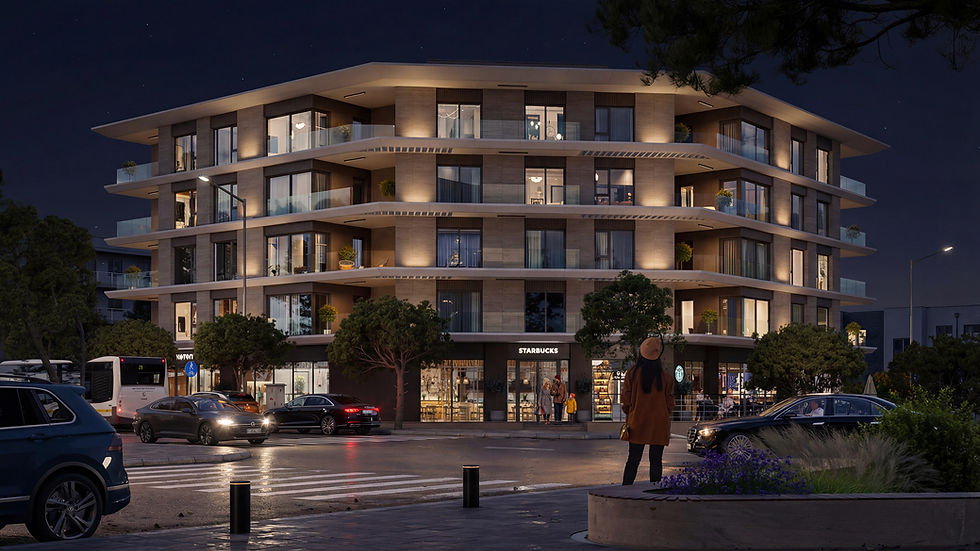
The commercial spaces located on the ground floor are separated from the upper residential floors by a darker and more controlled facade language. In this way, the corporate identities of units such as shops and cafes are integrated into the facade without compromising the overall architectural character of the building. Landscaping, common areas, and night lighting were also considered as part of the design, creating a strong external presence for the building both day and night.
Key decisions in this project
Rescaling window openings and fitting them into systematic modules.
60x120 cm travertine-look ceramic panel recommendation
Surface design suitable for mechanical facade applications.
Matt aluminum horizontal moldings and window top profile cladding.
Wide eaves effect that brings the residential floors together horizontally.
A vertical glass band proposal facing the dining area on the side facade.
Corner glass solutions recommended for living room corners.
The commercial ground floor is separated as a dark-colored, controlled base.
Integration of landscaping, common areas, and night lighting into the facade's visual appeal.
Project Example 2: Apartment Building Facade Design
In this apartment project, the facade design was developed with the aim of creating a more economical yet orderly, calm, and high-quality architectural language, taking into account the location and investment budget. The goal was not to make the building look different with expensive cladding materials; rather, it was to make the large mass more balanced, legible, and harmonious with its surroundings using a limited material inventory.

Instead of using costly cladding systems like stone, ceramic, or metal panels on the facade, color divisions, balcony openings, vertical and horizontal mass movements, window arrangement, and roofline were used as the main design tools. Thus, the facade was solved with an economical material language, but it was not left as a flat and ordinary apartment surface.

The massive building mass is broken up by white framing effects, beige-brown tones, and balcony recesses. The balcony facades give the building a repeating but controlled rhythm, while scale balance is achieved on the simpler side surfaces with joint lines and color transitions. The entrance area, garden wall, walkway, lighting, and landscaping decisions also ensure that the economical facade language is supported by a warmer and more reassuring environment.
The key approach in this project was not to view budget constraints as a reason to compromise on design quality. It was demonstrated that a clean, reassuring, and contextually appropriate apartment facade could be produced without expensive materials, through the use of correct proportions, a simple color palette, a controlled facade rhythm, a defined entrance, and a strong relationship with the landscape.
Key decisions in this project
An economical and minimalist surface finish instead of expensive coating materials.
Controlled color separation with beige, brown, white, and gray tones.
Adding depth and rhythm to the facade with balcony recesses
The perception of a large mass being more balanced with vertical and horizontal surfaces.
The roof system should be considered as part of the facade character.
Simple but controlled joints and surface divisions on the side facades.
The entrance wall, lobby approach, and landscaping are incorporated into the perceived value.
Realistic facade design that suits the location and investment budget.
Project Example 3: Precast Industrial and Workshop Building Facade Design


For this project, the facade design was explored with two different material and design alternatives. The first alternative proposed a more economical and controlled facade language using fiber cement and paint; the second alternative aimed for a stronger, more prestigious, and more corporate appearance with large-format 120x250 cm ceramic panels. Following an evaluation with the client, it was decided to proceed with the ceramic panel-dominated facade alternative because it created a cleaner surface effect, a stronger vertical rhythm, and a more sophisticated corporate image on the longer facade.

The primary goal of this project was to transform the repetitive industrial and workshop units from a simple warehouse appearance into a more organized, legible, and corporate architectural identity. The precast character of the building was not concealed; on the contrary, this rational structure was reinforced through the choice of materials, the vertical facade rhythm, signage areas, window proportions, and entrance canopies.

The proposed 120x250 cm ceramic panels on the main facade surfaces created a cleaner effect with fewer joints on larger surfaces. The panel arrangement was designed to work in harmony with the modular logic of the precast system. Thus, the facade was conceived not only as a decorative cladding surface but also as an architectural system that brings together the building's production, service, and corporate identity needs in the same layout.
The workshop and storage units, repeating along the long facade, are arranged in a rhythmic pattern with white vertical dividers, dark signage panels, narrow vertical window openings, and defined service doors. The wide shutters and service doors were not concealed from the facade; they were integrated as a natural part of the design. Light, turquoise-toned entrance canopies serve as a measured accent, making the entrance to each unit legible.

The black vertical panels, defined from the outset for company signage, prevented future signage clutter, giving the building a more controlled and corporate appearance. Thus, while each workshop/warehouse unit maintained its own identity, the building as a whole was perceived not as a disorganized industrial facade, but as part of a common architectural language.
The aim of this project was not to make the industrial structure appear different from what it is. Instead, it aimed to give the precast industrial building a more sophisticated, practical, and robust architectural character by addressing production, service, signage, natural light, entrance, and material decisions within the same facade system.
Key decisions in this project
Study of two different facade alternatives: fiber cement + paint and ceramic panel.
Following an evaluation with the employer, it was decided to proceed with the 120x250 cm ceramic panel alternative.
The facade design preserves the modular character of the precast industrial building.
Vertical rhythm and distinguishing elements break the monotony of the long facade.
Defined signage surface for each workshop/warehouse unit.
Inclusion of wide shutters and service doors in the facade composition.
Clarifying corporate identity areas with dark-colored vertical panels.
Controlled use of natural light through narrow, vertical window openings.
Making unit entrances legible with turquoise-toned entrance canopies.
Project Example 4: Facade Design Separating Commercial Ground Floor from Office Zone
The main decision regarding the facade design of this project was to consciously separate the commercial uses on the ground floor from the office units on the upper floors. It was anticipated that the cafe, shops, and various commercial units located on the ground floor would develop a variable appearance over time in terms of signage, window display arrangement, corporate colors, and usage patterns. Therefore, instead of a single vertical structure that continues uninterrupted from the ground floor to the upper floor, the facade was approached with a more controlled horizontal strategy separating the commercial ground floor from the office floor.

On the upper floor, the aim was to create a calmer and more cohesive identity for the office spaces, independent of the potential branding and signage clutter on the ground floor. The office floor was conceived as a rhythmic and singular facade band defined by vertical louvers. Thus, even though the building is multi-user, a more orderly and prestigious office feel is maintained on the upper level.
The vertical louvers used on the facade were treated as a primary design tool that addressed multiple needs with a single movement. They added rhythm and depth to the upper office floor while providing sun control on the heavily sunlit south and west facades; they created privacy for the offices, concealed technical elements such as air conditioning units within the facade, and grouped signage areas in a more controlled arrangement.

The relationship between the entrance canopy, landscaping, pedestrian approach, and parking was also resolved as part of the design. In particular, the long canopy at the main entrance served not only as a protective element but also as a threshold defining the approach to the building, reinforcing the perception of prestige, and making the office identity visible on a street scale.

The undulating line that runs along the long facade softens the rigidity of the mass, giving the building a more fluid and recognizable character. The aim of this project was to control the visual clutter that different users and brands might create over time; to establish a flexible and vibrant office facade on the ground floor, and a more orderly, prestigious, and holistic facade on the upper floor.
Key decisions in this project
The commercial ground floor is deliberately separated from the upper office area.
Anticipating potential signage, window displays, and brand clutter on the ground floor from the outset.
Instead of a continuous vertical facade from the ground floor to the upper floor, a controlled horizontal layering strategy will be implemented.
The aim is to create a calmer, more holistic, and prestigious facade perception on the upper office floor.
The vertical slats create rhythm, sun control, privacy, and depth.
Concealing technical components such as air conditioning outdoor units within the facade.
Controlled resolution of office signage areas within a lamella arrangement.
Separating the office entrance from the commercial floor movement with a long entrance canopy.
Breaking the rigidity of the long mass with an undulating front line.
Project Example 5: A Holistic Villa Approach from Architectural Design to Facade
In this villa, for which we also undertook the architectural project, the facade was not treated as an external surface added to the building later, but rather as a natural architectural outcome that developed together with the plan, interior space, garden, privacy, and material decisions. Therefore, in the project, the facade design was considered not only in terms of how it looks from the outside, but also in terms of how the building is lived in, how it receives light, how it relates to the garden, and how it defines the boundary between itself and the street.

A simpler, more controlled, and private expression was preferred on the street facade. Solid surfaces, a vertical metal fence, a garden wall, and a dense plant border created a calm threshold that did not completely close the building off from the outside, but preserved the privacy of the residence. In contrast, the garden facade was designed with large glass openings, a terrace, a pool, and open living spaces, creating a more permeable and life-oriented character.

The building's material language was also developed to support this two-way relationship. White masses, natural stone surfaces, wood-effect claddings, wide eaves, and controlled glass openings created a simple and strong atmosphere from the outside, and a warm and livable atmosphere from the inside. This material language was continued in the interior, providing a holistic character throughout the building.

The garden, pool, terrace, seating area under the trees, service approach, and plot boundaries were all considered as part of the architectural integrity. The building's more controlled orientation towards the street and its more open orientation towards the garden were fundamental design decisions, both for privacy and daily life comfort.

This project served as an example demonstrating that facade design yields much stronger results when considered in conjunction with the architectural project. Here, the facade functioned not only as the building's exterior but also as a holistic architectural decision-making area that encompassed privacy, its relationship with the garden, the interior atmosphere, and the perception of day and night.
Key decisions in this project
Architectural project, facade, interior and garden design decisions are developed together.
Establishing a controlled and private architectural language on the street facade.
Large glass surfaces on the garden facade create a permeable living relationship with the terrace and pool.
A simple yet warm material language is established through white mass and natural stone and wood-effect surfaces.
Wide fringes enhance the effect of shadow, depth, and horizontality.
Designing interior openings according to natural light, views, and usage scenarios.
Inclusion of garden, pool, terrace and shaded seating area in the architectural living scenario.
The facade language should establish continuity with the interior material and lighting decisions.
Project Example 6: Facade Improvement and Outdoor Living Design in an Existing Villa Project
In this project, the existing architectural design was re-evaluated, focusing on the facade language, entrance definition, exterior uses, and garden layouts. The aim was to elevate the facade proportions, material transitions, entrance effect, and open living spaces to a more legible, refined, and practical level without altering the building's core architectural decisions.

A more balanced exterior appearance was created by considering white masses, natural stone-effect surfaces, wood-textured vertical elements, glass railings, and dark-colored window frames together on the facades. Especially on the entrance facades, the ratio of doors, eaves, vertical wooden surfaces, windows, and garden approach were considered together to ensure that each villa gains a more defined and strong welcoming effect.
In this project, the facade design was not limited solely to external surface decisions. Terraces, infinity pools, sunbathing areas, barbecue areas, pergolas, hardscape transitions, gravel bands, planting borders, and garden seating areas were also considered as part of the building's external perception. Thus, the facade, garden, and open living spaces were not conceived as separate parts, but rather as a holistic outdoor language supporting the same living scenario.

Particular attention was paid to the relationship between the pool and the terrace. Infinity pools were designed not only as visual prestige elements, but also as key outdoor elements that work in conjunction with the view orientation, terrace use, sunbathing area, seating arrangement, and garden boundaries. Barbecue and seating areas were treated as complementary spaces that support daily use and enhance the villas' outdoor living capacity.

This study served as a good example of how an existing architectural project can be strengthened by facade and exterior design decisions. While respecting the building's main architectural framework, the facade language, the entrance effect, material transitions, the pool-terrace relationship, and garden uses were refined, creating a more livable and visually powerful whole.

Key decisions in this project
Development of the facade design based on the existing architectural project.
Making facade details more practical and refined.
Villa entrances are made more defined with doors, eaves, vertical wooden surfaces, and landscaping.
The design combines white mass, natural stone, wood-textured surfaces, and dark joinery.
Infinity pools should be considered in conjunction with landscape, terrace, and daily use scenarios.
Inclusion of barbecue, sunbathing, seating and outdoor dining areas in the garden layout.
Organizing transitions between hard surfaces, gravel, wood decks, grass, and vegetation.
Enhancing privacy through garden boundaries and landscaping.
Integrating facade, terrace, pool and landscaping decisions within the same outdoor living language.
Project Example 7: A Mixed-Use Structure Characterized by Balcony Rhythm and Staircase Core
In some projects, what strengthens a facade is not so much the variety of materials used on the surface, but rather the accurate interpretation of the building's own architectural decisions. In this mixed-use building, the facade character was developed through the form of the balconies, the balance between voids and solids, the vertical and horizontal proportions, and the treatment of the stair core as an independent element on the facade.

This work progressed in close collaboration with the architectural office, established during the preliminary design phase. Initially, the process developed based on plan decisions, with our team establishing the main guidelines that determined the building's facade character. Balcony rhythms, mass balance, core emphasis, and facade proportions were shaped accordingly. The process wasn't limited solely to surface decisions; revisions affecting the plan where deemed necessary were made to create a more consistent relationship between the facade and the architectural design.

The recurring rows of balconies on the residential floors gave the building both rhythm and a strong sense of scale. The balconies were conceived not merely as exterior additions, but as key elements that established the facade composition and made the structural logic of the building visible. Balcony depths, parapet proportions, corner turns, and their relationship with the load-bearing system were considered together.

The stair core was not left as merely a functional circulation area in the structure; it was designed to be read as a separate vertical element on the facade. Thanks to its surface and glazed void that differentiate it from the main mass, the core became an architectural landmark that balances the horizontal balcony arrangement and gives the building a strong central effect.

The commercial strip on the ground floor was deliberately separated from the residential mass above. The continuous eaves line, transparent shop windows, and the commercial layout set in the background helped to more clearly define the character of the residential buildings on the upper level. Thus, while the ground floor functions as a vibrant and public space, a calmer, more balanced, and integrated facade language was maintained on the upper floors.
The fundamental approach in this project was not to clutter the facade with material games, but to highlight the architectural potential that the building already possesses. When the form of the balconies, the counterpart of the stair core, rhythm, proportion, and structural logic are considered together, the facade is able to generate a strong architectural character on its own.
Key decisions in this project
The character of the facade is established through architectural proportion and rhythm rather than material variety.
Balconies should be considered as the main elements determining the facade composition.
Making the relationship between balcony form and structural logic an integral part of the design.
The emphasis on the stair core as an independent and defined vertical element on the facade.
A balanced facade composition is created between the horizontal balcony arrangement and the vertical core effect.
The commercial zone on the ground floor is deliberately separated from the residential mass above.
Control of public movement on the ground floor through a continuous canopy.
Facade design is used as a tool to guide the architectural design in the preliminary stages.
Project Example 8: Office + Commercial Building Defined by Modular Rhythm and Brick Surface
The main idea behind the facade design of this project was to create a unified yet clearly distinct structure between the commercial spaces on the ground floor and the two office floors above. The aim was to create a more dynamic and varied commercial surface on the ground floor, while producing a calmer, more controlled, and corporate facade character on the upper levels.

The fundamental design element along the facade was a system constructed with 70, 140, and 210-centimeter modules . This modular arrangement provided a clear order to the facade while preventing repetition from becoming rigid and monotonous, through controlled shifts. Thus, a composition was created on the facade that was regular but not entirely uniform; rhythmic but not appearing mechanical.
On the upper floors, window openings, recessed niches, and solid surfaces were balanced within this modular system. The corner effect was also important in this structure; facade decisions were considered not only for the front surface but also to ensure that the corner turn of the building was legible and powerful. In this way, the building was able to function not just as a shell but as a defined corner structure within the city at its location.

The commercial area on the lower floor was deliberately separated from the upper levels. The continuous signage band and window openings define the flexibility required for commercial use, while preventing this dynamism from disrupting the corporate identity of the upper floors. This separation between the ground and upper floors was one of the key decisions that enhanced the building's readability.
In material selection, brick cladding was preferred to create a more durable character that harmonizes with the surrounding texture. However, brick is not treated here as a superficial choice that alone gives character; rather, it is considered a complementary layer that supports the modular facade design and enhances the effect of depth and rhythm.
The open design of the building's interior gallery also provided an advantage in simplifying the facade design. The absence of a need for additional concealment or masking solutions for technical equipment on the facade allowed the upper surface to remain cleaner and more controlled. Thus, the facade was able to achieve a strong architectural expression with its own rhythm and proportions, without being cluttered with unnecessary additional elements.
Key decisions in this project
The commercial spaces on the ground floor are deliberately separated from the two office floors above.
Establishing a clear system along the facade using 70 / 140 / 210 cm modules.
Creating "regulated disorder" through controlled shifts to produce rhythm without making repetition monotonous.
Designing a calmer, more corporate, and controlled office facade on the upper floors.
Defining a more flexible commercial surface on the ground floor with a display and signage strip.
The corner effect is considered as a design element that strengthens the urban perception of the building.
The use of brick cladding as a surface that blends seamlessly with the surrounding environment and supports a modular system.
Thanks to the open interior gallery, there is no need for additional solutions such as concealing air conditioning units in the facade.
The facade's character is established not so much through material variety but through proportion, modulation, and rhythm.
Conclusion: Good Facade Design Produces a Different Response in Every Building.
These project examples demonstrate that facade design cannot be defined by a single style or material language. In some projects, the main decision that strengthens the facade is window modulation and mechanical facade details, while in others, budget management, signage control, the use of large panels, entrance canopy, commercial floor separation, balcony rhythm, stair core, or garden-pool relationship become decisive factors.
At AllRender, we view facade design not as an afterthought, but as a decision-making process developed based on the project's scale, budget, use, and architectural potential. Therefore, instead of repeating the same approach in every project, we prioritize developing a balanced, feasible, and characterful facade approach that stems from the building's own needs. If you would like support with facade design, exterior rendering, or architectural visualization, please contact us to discuss your project together.


Comments